How SaaS Website Design Services Can Increase Conversions
SaaS website design services increase conversions by removing friction, clarifying value, and guiding visitors toward one specific action. A strong SaaS site does not just look polished. It explains the product fast, builds trust before doubt grows, and makes sign-up feel low risk.
TLDR: Good SaaS website design can turn more visitors into trials, demo requests, and paid users by improving messaging, page structure, speed, and trust signals. For example, a B2B SaaS company with 20,000 monthly visitors could raise trial sign-ups from 2.1% to 3.4% after redesigning its homepage, pricing page, and demo flow. That change would mean about 260 extra trials per month without buying more traffic. The work is not cosmetic; it is tied to revenue.
Why SaaS Conversions Depend So Heavily on Design
SaaS buyers are cautious. They compare tools, read reviews, check pricing, and look for risks. If your website makes them work too hard, they leave. Honestly, it feels like many SaaS sites hide the answer people came for: what does this product do, who is it for, and why should I trust it?
Design services help answer those questions with structure. The best teams combine UX design, conversion research, SaaS copy strategy, analytics review, and visual design. The result is a website that feels clear, credible, and easy to use.
A visitor should understand your product within a few seconds. They should know what to click next. They should not have to guess whether the product fits their use case.
Clear Positioning Turns Confused Visitors Into Qualified Leads
Many SaaS websites lose conversions at the hero section. The headline is vague. The subheading is stuffed with buzzwords. The call to action is weak. This is costly because the top of the page shapes the whole visit.
A conversion-focused SaaS design service will refine the first screen around three elements:
- A specific headline that states the outcome, not just the category.
- A short support line that explains who the product helps and how.
- A clear primary action, such as “Start free trial” or “Book a demo.”
For example, “Project management software for modern teams” is weak. It sounds like dozens of other tools. A stronger version might be: “Plan client projects, track approvals, and cut missed deadlines by 30%.” It gives buyers a reason to keep reading.
Better User Flows Reduce Drop-Off
Every SaaS site has a path it wants visitors to take. The problem is that many sites add too many exits. There are competing buttons, unclear menus, long forms, and pages that feel disconnected.
Expect to waste time on sign-up flows when they ask for too much too soon. If a visitor wants to test a product, forcing them through eight fields can damage intent. A good design team reviews each step and asks one blunt question: does this help the user move forward?
Common improvements include:
- Reducing form fields from ten to four.
- Adding social login for faster account creation.
- Moving optional questions after sign-up.
- Making demo booking calendars easier to find.
- Keeping pricing, features, and proof close together.
Small changes can have large effects. If a demo form drops from seven fields to three, completion rates may rise because the request feels less demanding. That matters most for paid acquisition, where each abandoned form wastes budget.
Trust Signals Make Risk Feel Smaller
SaaS buyers worry about wasted time, messy onboarding, hidden costs, poor support, and security issues. Design can answer these concerns before the visitor asks them.
Strong SaaS website design places trust signals where doubt appears. This includes customer logos near the hero section, short testimonials beside calls to action, security badges near forms, and case study links near industry claims.
Useful trust elements include:
- Customer logos from recognizable companies or relevant niche brands.
- Client quotes with names, roles, and company details.
- Usage metrics, such as “used by 12,000 support teams.”
- Security notes, including SOC 2, GDPR, SSO, or encryption details.
- Case studies tied to measurable results.
Trust is more convincing when it is specific. “Loved by teams worldwide” sounds soft. “4,800 finance teams use our platform to review contracts faster” is stronger.

Pricing Pages Can Win or Lose the Sale
The pricing page is one of the most important conversion points on a SaaS website. Visitors who reach it often have high intent. If the page is confusing, the sale slows down.
A conversion-focused pricing page should help users choose with confidence. It should not bury limits, create surprise fees, or make every plan look the same. Clear plan names, feature grouping, FAQs, and a highlighted recommended plan all help.
Good SaaS design services often test pricing page elements such as:
- Monthly versus annual toggle placement.
- Plan comparison tables.
- Usage limits and overage explanations.
- Trial messaging near each plan.
- Enterprise contact prompts.
The goal is not to push everyone into the most expensive plan. The goal is to match the right buyer with the right option. That reduces refund risk and improves customer quality.
Performance and Mobile Design Affect Revenue
Speed is part of conversion design. A beautiful page that loads slowly still loses leads. If a SaaS homepage takes five or six seconds to load, visitors may leave before reading the headline.
Professional SaaS website design services should check page speed, mobile spacing, image weight, script load, and Core Web Vitals. This work sounds technical, but the business impact is simple: faster pages keep more people in the funnel.
Mobile also matters, even for B2B SaaS. A buyer might discover the tool on a phone, send it to a colleague, then return later on desktop. If the first mobile visit feels broken, that second visit may never happen.
Conversion Copy and Design Must Work Together
Design cannot fix unclear copy. Copy cannot save a messy layout. SaaS conversion improves when both work as one system.
Effective pages use plain language, short sections, and clear proof. They avoid generic claims. They explain features through outcomes. Instead of saying “advanced analytics dashboard,” a stronger section might say: “See which accounts are at risk before renewal week.”
This helps visitors connect product features to business value. It also makes the page easier for sales teams to use during calls.
Analytics Should Guide the Redesign
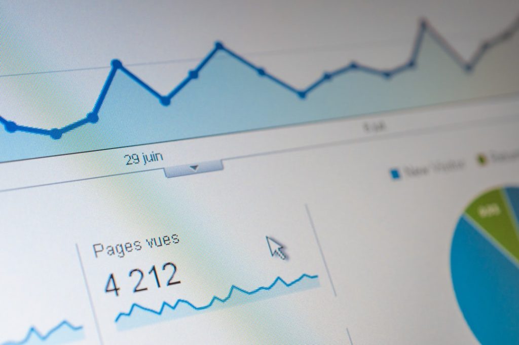
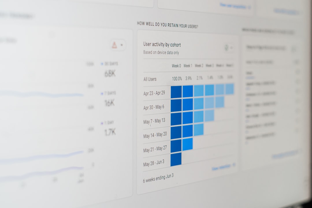
Trustworthy SaaS website design services do not rely only on taste. They review data before making major changes. This can include heatmaps, scroll depth, funnel reports, session recordings, user surveys, and CRM data.
Important metrics include:
- Visitor-to-trial conversion rate.
- Visitor-to-demo conversion rate.
- Form abandonment rate.
- Pricing page exit rate.
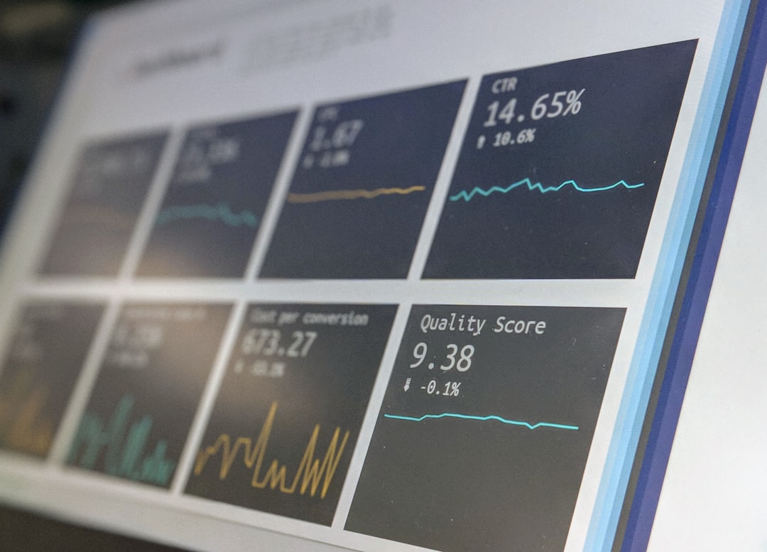
- Click-through rate on primary calls to action.
- Trial-to-paid conversion rate.
If analytics show that 62% of users leave the pricing page without clicking anything, the issue may be plan clarity, price framing, or missing reassurance. If many users click “Book a demo” but abandon the form, the form may feel too long or too intrusive.
How SaaS Design Services Support Sales Teams
A better website does more than generate leads. It can improve lead quality. Sales teams benefit when pages explain use cases, qualify visitors, answer buyer objections, and show proof by industry.
For demo-led SaaS companies, this is critical. A visitor who reads a clear solution page and watches a short product tour arrives at the call with more context. The sales conversation can then focus on fit, timing, and budget instead of basic education.
This can shorten the sales cycle. It can also reduce no-shows because prospects understand what they requested.
What to Expect From a Serious SaaS Website Design Service
A serious provider should ask about revenue, not just colors. They should want to know your acquisition channels, sales cycle, product maturity, current conversion rates, and customer segments.
A strong process usually includes:
- Website audit: Review UX, messaging, speed, SEO, and conversion paths.
- Customer research: Study buyer concerns, objections, and decision criteria.
- Information structure: Organize pages around user intent.
- Wireframes: Define layout before visual polish.
- Copy and visual design: Build pages that explain and persuade.
- Testing: Track performance after launch and improve weak points.
Redesigns should not be treated as one-time art projects. SaaS markets change. Products mature. Messaging must be reviewed often.
The Real Value Is More Revenue From the Same Traffic
The main value of SaaS website design services is efficiency. If you already spend money on SEO, paid search, content, or outbound campaigns, your website must convert that attention into action.
Raising conversions from 2% to 3% may sound small. It is not. With 50,000 monthly visitors, that shift creates 500 more sign-ups each month. If 8% become paid customers at $120 per month, the impact is meaningful.
Good SaaS design makes the buying process feel clear, safe, and worth continuing. It respects the visitor’s time. It answers doubt early. Most of all, it connects product value to business results without making users hunt for the point.