


What Is an Access Control Entry (ACE)? Complete Guide With Real-World Examples
Access control is one of the most important foundations of secure IT operations. Whether an organization is protecting a shared folder, a database, a cloud…
Access control is one of the most important foundations of secure IT operations. Whether an organization is protecting a shared folder, a database, a cloud…
Reducers are a small but powerful idea that appears in everyday JavaScript, state management libraries such as Redux, and the broader world of functional programming….
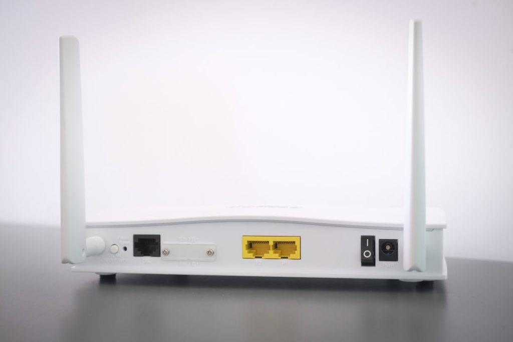
Weak WiFi is one of the most common home networking problems, but the solution is not always as simple as buying the first device labeled…
Few things are more frustrating than trying to connect a phone, laptop, smart TV, or printer to Wi-Fi and being asked for a network security…
AI voice agents are like friendly robot receptionists. They answer calls. They ask questions. They book meetings. They send notes. And they do not need…
Business automation is entering a new phase. For years, companies used software to automate repetitive tasks: move data from one system to another, send alerts,…
Marketing operations managers are the air traffic controllers of modern marketing. Campaigns are flying in. Reports are circling. Tech tickets are blinking. Sales wants answers….
A Metropolitan Area Network, or MAN, is the middle ground between a local network inside a building and a wide network spanning countries or continents….
Email nurture drip sequences work best when their timing reflects both buyer readiness and attention span. A common approach is to send the first few…
Every organization has ambitions: launch a product, improve customer service, expand into a new market, or simply deliver work more efficiently. But ambitions do not…