One-Pager Examples: 7 Business and Personal Website Layouts for Presenting Services, Portfolios, and Product Offers
Use a one-page website when your visitor needs one clear path: understand, trust, act. That is the big win. People often leave pages within 10 to 20 seconds if the value is not clear, so your top section has to work hard [source: Nielsen Norman Group].
TLDR: A one-pager is best when you sell one service, show one portfolio, or promote one product offer. Keep the top section simple: headline, short proof, and one button. For example, a freelance designer could show 3 best projects, 2 client quotes, and a Book a call button above the fold. If 100 people visit, even a small 3% contact rate means 3 new leads from one clean page.
Why one-pagers work so well
A good one-pager feels like a guided tour. No maze. No “where do I click now?” moment. Just a clean path from curiosity to action.
The catch is, many one-pagers try to say everything. That gets messy fast. A one-page layout should not be a dumped folder of text, buttons, icons, and stock photos. It should feel edited.
Here are 7 one-pager examples you can use for business, personal brands, portfolios, and product offers.
1. The service expert layout
This layout is perfect for coaches, consultants, writers, trainers, and local pros.
- Hero: Say who you help and what result you bring.
- Problem: Name the pain your visitor has.
- Services: Show 3 simple service cards.
- Proof: Add testimonials or short case wins.
- CTA: Use one button, like Book a free call.
Example headline: “I help small clinics turn website visitors into booked patients.” Simple. Clear. Useful.
2. The portfolio-first layout
This is great for designers, photographers, developers, artists, and video editors.
Put your work near the top. Not after five blocks of self-praise. Honestly, it feels like a chore when a portfolio makes people scroll forever before showing the actual work.
- Start with a bold name and job title.
- Show 4 to 6 top projects.
- Add one sentence under each project.
- Include tools used, role, and result.
- End with contact options.
Keep case studies short. Use before and after shots if you have them. Results beat pretty words.
3. The product offer layout
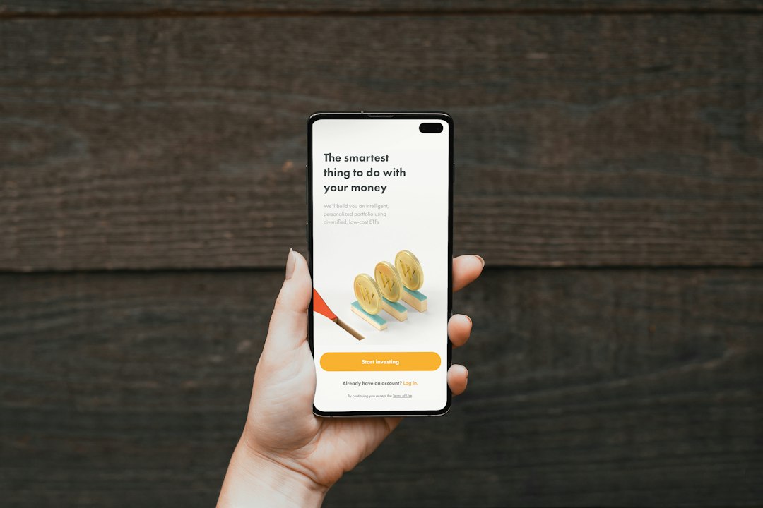
This layout sells one thing. It could be an app, course, ebook, template pack, or physical product.
The best order is simple:
- Big promise: What does the product help people do?
- Image or demo: Show the product in use.
- Benefits: List what gets easier.
- Social proof: Add ratings, buyer quotes, or numbers.
- Pricing: Make it clear.
- FAQ: Remove doubt.
Do not hide the price if the product is simple. That makes people suspicious. Or annoyed. Usually both.
4. The personal brand layout
This one works for speakers, founders, creators, writers, and public experts.
The goal is not to list your whole life. The goal is to make people remember you.
- Hero: Strong photo, short positioning line.
- Credibility: Logos, press, wins, or audience size.
- Topics: What you speak, write, or teach about.
- Featured work: Videos, podcasts, books, posts.
- Contact: Speaking, media, or project inquiry form.
Example line: “I teach non-technical founders how to explain complex products.” That tells people exactly why you matter.
5. The local business layout
Use this for salons, repair shops, pet groomers, cafés, gyms, and home services.
Your page should answer quick questions. Where are you? What do you offer? What does it cost? Can I book now?
- Add your phone number in the top section.
- Show hours and location.
- List core services with starting prices.
- Add customer reviews.
- Use a sticky Call now button on mobile.
Mobile matters a lot here. People may be standing on a sidewalk with 8% battery. Do not make them pinch and zoom like it is 2011.
6. The startup landing page layout
This layout is for new apps, SaaS tools, and beta products.
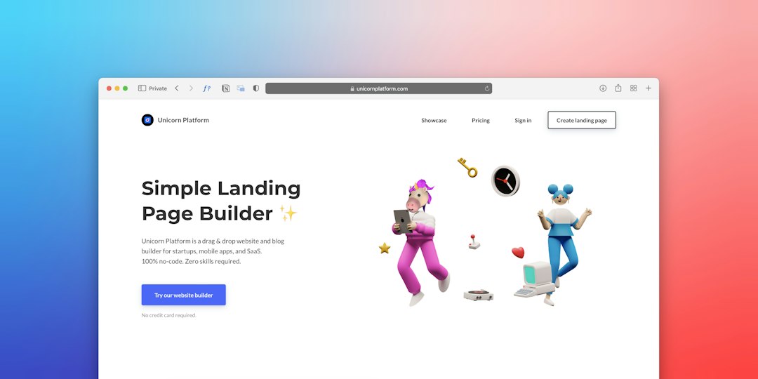
Keep it sharp. Start with the pain. Then show how the product fixes it. Use screenshots, not vague promises.
- Hero: Product promise and signup button.
- Use cases: Show who it is for.
- Features: Keep this short.
- Demo: Add a video or product GIF.
- Signup: Invite users to try it.
A small tip: one main button is enough. If you add five options, you are asking visitors to do your planning for you.
7. The event or webinar layout
This one-pager sells attendance. Great for workshops, launches, webinars, retreats, and meetups.
- Lead with the event title and date.
- Say who should attend.
- List 3 to 5 things people will learn.
- Show the host or speaker bio.
- Add schedule, price, and signup button.
Use urgency with care. A real seat limit is fine. Fake countdown timers feel cheap. People notice.
Quick layout rules that save time
- Use one main goal. Booking, buying, joining, or contacting.
- Keep sections short. Think blocks, not essays.
- Repeat the CTA. Top, middle, and bottom works well.
- Use real proof. Names, numbers, screenshots, or quotes.
- Cut weak text. If it does not help the visitor act, remove it.
A one-pager is not small because it lacks value. It is small because it respects attention. Pick the layout that fits your goal. Then make every section earn its place.